The end of the year is always a time of reflection but for us at WECREATE is just as much about looking towards the future as we want to continue to provide you with solutions that are on trend and relevant.
2017 has been the year in which mobile use overtook desktop browsing. This big shift means that we, designers, need to focus on mobile functionality while keeping desktops attractive and relevant at the same time. Through new technology an array of new possibilities continually becomes available to do so. As a digital medium, web design is very much linked to developments in technology. In the past when ‘digital’ was a new experience the design community mainly stuck to minimalism, everything had to look ‘clean’ as not to overwhelm the user. Now that we have had time to get acquainted with digital technology and feel comfortable with it trends are shifting. Lets take a look at the most prominent changes we are seeing in the world of web design.
dribbble.com/zakeklund
Grids
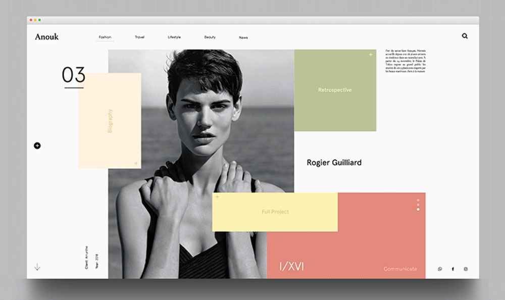
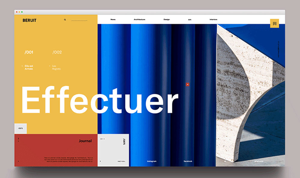
Grids have always existed to bring harmony and logic to a layout but also provided constraint in design. The trend of using broken and asymmetrical grids already started in 2017 and is expected to grow even stronger in 2018. We will see images and text elements drift into and across the ‘hard line’ of the screen creating a unique and distinctive look.
dribbble.com/ghanipradita
Illustrations
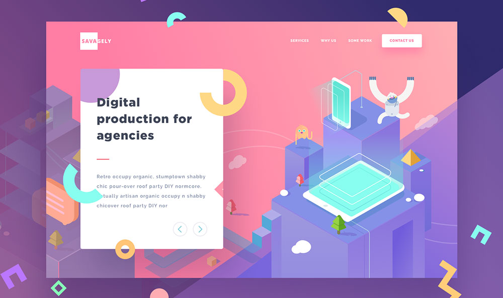
In 2018 we will continue to see the work of illustrators grow more prominently. In the 60’s illustrations dominated the marketing world before photography became a trend. It seems the cycle has come full circle. Good artists can create illustrations full of personality and customized to your brand – great if you’re looking for more individuality among the crowds.
dribbble.com/zakeklund
Maximalism
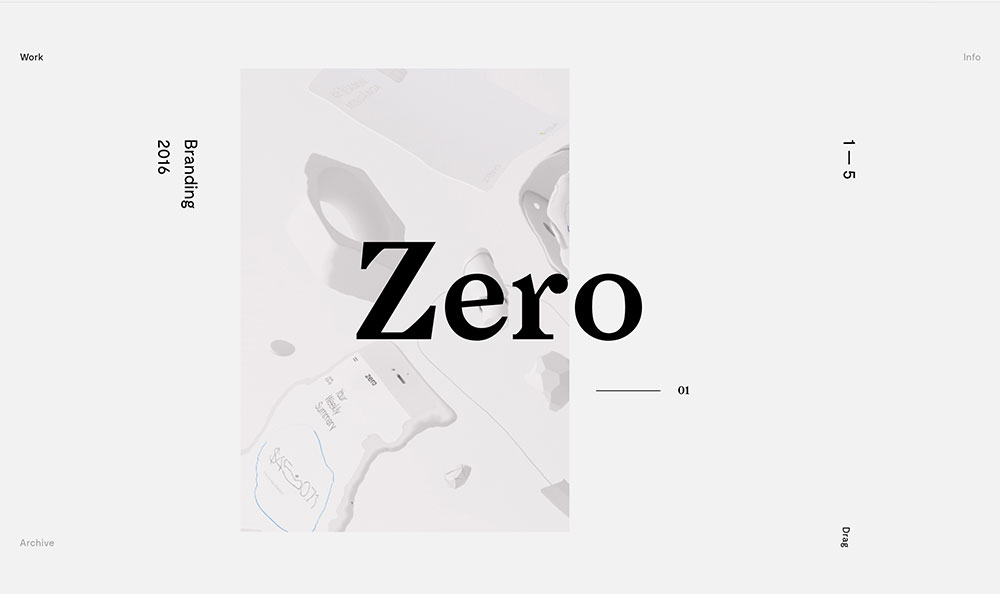
Digital screens no longer have to be ‘clean’. Users have become very digitally savvy and no longer need to be protected from getting overwhelmed. In 2018 we’ll see less minimalist designs, as the expectation is that users will be able to navigate their way around a site. Screens will look busier, more colorful and with more visual distractions or rather ‘attractions’.
benmingo.com/zero
Typography
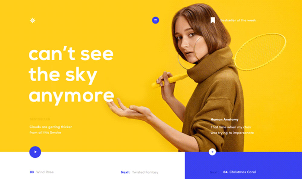
More elaborate typefaces will be used on screen. Serif is making its comeback now that our screen and font rendering technologies are much improved compared to the early digital era. The expectation is that there will be a huge increase in the use of custom fonts. The use of large letters, contrasting sans serif and serif headings will improve UX and keep the reader engaged.
dribbble.com/fromshota
Colors & Shapes
2018 is definitely the year for super vibrant colors online. Monitors and devices nowadays are able to perfectly reproduce these richer colors, which is why super saturation and vibrant shades (even flashing or vibrating) can now take centre stage online. Traditional hard and soft edge card-shape designs are shifting to more organic shapes for both primary elements and backgrounds alike. Organic and spherical shapes are effectively used together with hard-edged objects. This development is a big part of the maximalism trend we’re seeing throughout the digital sphere.
dribbble.com/gilhuybrecht
Animations
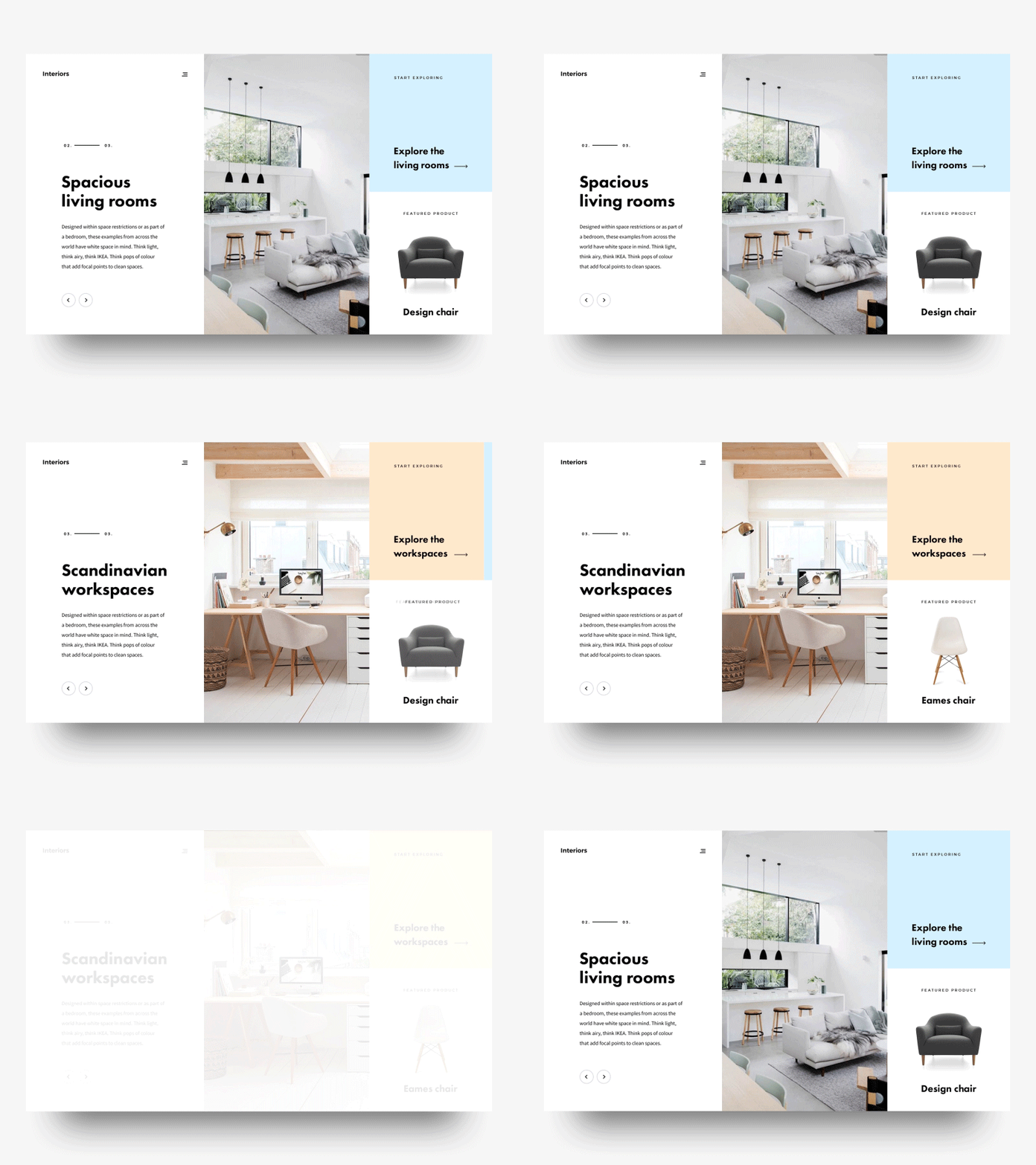
More and more websites are moving away from static images to introducing animations in an effort to engage users in their communication approach. Animations can be characters or abstract visuals and work well to create more meaningful interactions with visitors. It can enable them to see themselves (as a potential customer) in the character or animate the user while navigating and waiting for pages to load. We’ll see more and more moving animations in 2018 with the aim to achieve more engaging experiences.

