Investing in mobile apps so you won’t miss out a huge opportunity. If you think that only large companies or brands such as MTR, Broadway Circuit, and Citibank need mobile apps, you are wrong.
More and more small corporations and startup companies app development their own apps to build up brand recognition and a better customer-company connection. People nowadays use their phones more than any other electronic devices. Having a company website is a must, and having a mobile app with the right app design is an indispensable marketing strategy.
However, not every company who has its own mobile app can make its brand more competitive and profitable. A poor mobile app design will deliver a bad representation of the company and is doing more harm than good. With this in mind, we bring you the top mobile app design trends of 2016 that you need to be aware of before designing your coming mobile application.

Simplification in app design is essential
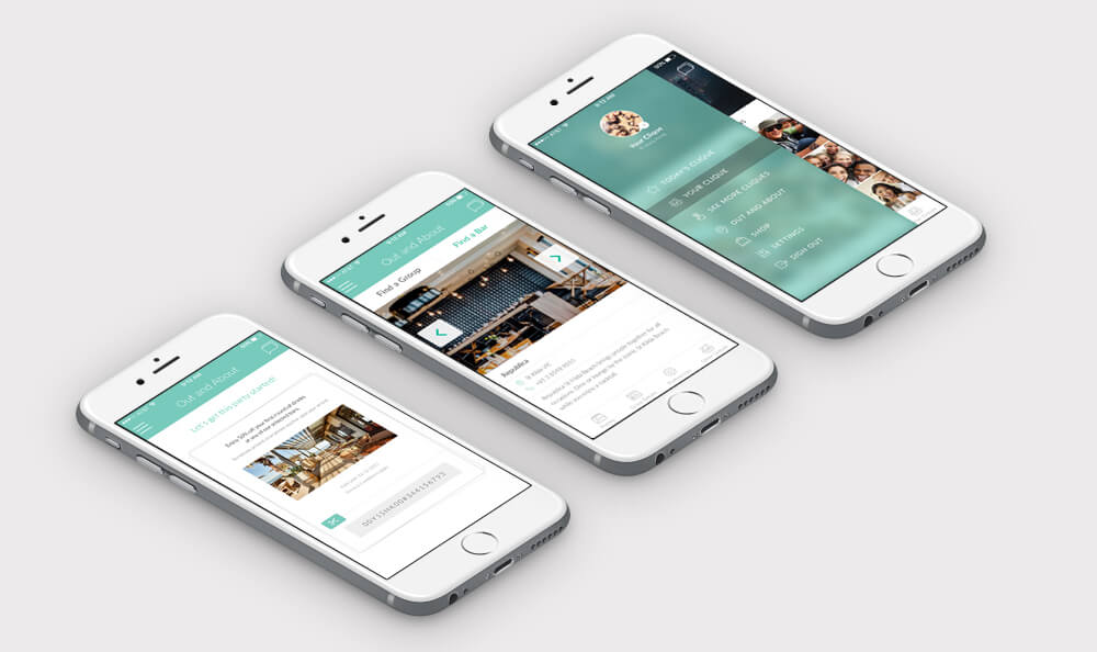
aking WECREATE’s Clique app design as an example, its clean, clear, friendly icons definitely make the different categories easy and visibly navigable. It is inconvenient filling in complex forms and reading a wordy paragraph, especially on their handy small mobile screens. Offering too many choices will only confuse users and keep them from accessing what they really want. Therefore, using simple and neat icons, line and shape patterns and interactive charts for your app is enough to present a company’s functions without overwhelming users. WECREATE SG creates app designs that are in accordance with your users’ expectations.
Color Appeal
Color is the first visual appeal to users. Choosing the right colors wisely can really make a huge difference. Blending colors gently in mobile apps can absolutely advance the user experience to a nicer and more elegant level.
More Emphasis on Typography in app design
Choosing a right font is an important task in designing mobile apps. A right font allows company to represent certain style and evoke a particular meaning. Using different sizes also tells users what you want to emphasize on.

Horizontal Sideways Scrolling
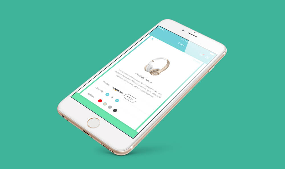
When scrolling vertically becomes a popular and convenient navigation, then why not scrolling sideways? Demonstrated in WECREATE’s SHOPiDE mobile app design, we went with a horizontal scrolling approach to display our user’s shopping cart items. This clear and creative navigation makes heavy content easier to access and read by users. Horizontal sideways scrolling gradually becomes a trend in mobile apps because it can be used as a slideshow to display company’s products and their features in a neat and elegant interface.
Personalization and Storytelling in app design
In order to build a stronger relationship with users, mobile apps have to provide a personal experience based on users’ preference and behavior to let users know that they are unique and being concerned. Many popular and well-known brand apps, such as Starbucks and Nike+ Running, can successfully boost its business because their apps not only present a simple and efficient UI, but also tell a good story featuring individual user by delivering an all-round service and intimate care. With the Nike+ app, users can track their route, distance, and time, and share their pictures of their run to friends. This personalized app experience plays an increasing role in the overall mobile app development trends.
Adding Payment with Fewer Clicks app UI
Mobile payment is a necessity and is becoming a huge component in developing a mobile app. People use their handy phones 24/7 anywhere, so a payment service on mobile apps makes buying and selling more user-friendly and convenient. When people see something they are interested in, they can make quick purchases, with just a few touch of buttons, using mobile apps.
Interested in getting a new app design? Having some awesome ideas in your mind? Looking for the right App Development Company in Singapore? Don’t hesitate to make it happens. Get in touch with us and we are more than happy to be of service!


